Ladd Stamps

Ladd Stamps

A usability-focused e-commerce website redesign

A usability-focused e-commerce website redesign

project-image

Year

2025

Type

UX/UI Design

UX Research

Marketing

Team Members

Pik Yee Debbie Cheng, Kerstie Ladd Lim, Beatrice Maxine Ramos

Project Overview

Ladd Stamps is an e-commerce brand offering highly customizable stationery products. The primary challenge was improving the online shopping experience for mobile users while reducing errors during customization process. The goal was to redesign key parts of the website to improve usability, and clarity while supporting business growth.

My Role

I worked on this project as a UX Researcher and UX/UI Designer, collaborating closely with an SEO engineer. My responsibilities included user research, usability testing, marketing analysis, and UI design improvements. I analyzed user behavior across desktop and mobile, identified friction points in the purchase flow, and proposed design solutions to improve product discovery, customization accuracy, and overall online shopping experience.

project-image

Research & Direction

Research & Direction

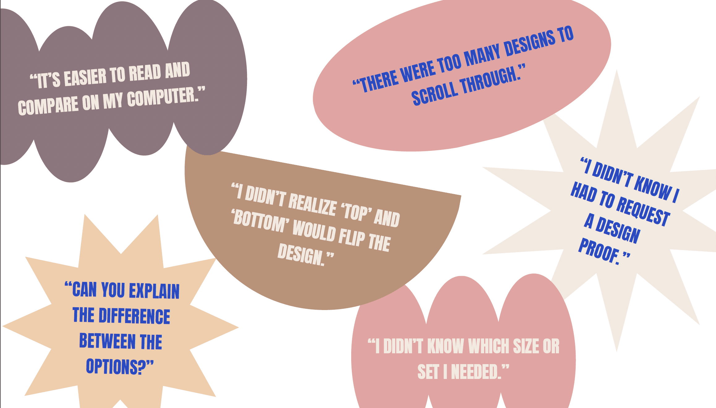
Research and usability testing showed that more than half of users preferred browsing and purchasing on desktop, as they found mobile interfaces difficult to read and navigate. The single-column mobile layout contributed to excessive scrolling and product fatigue. Users also frequently missed customization options or selected incorrect ones due to unclear option hierarchy and lack of validation. Product pages with multiple visual variations, such as birth flower and zodiac designs, required repeated tapping to view details, interrupting browsing flow.


These insights helped shape a design direction that enhanced usability, reduced user errors, and supported stronger business performance.

project-image
project-image
project-image

Key Changes

Key Changes

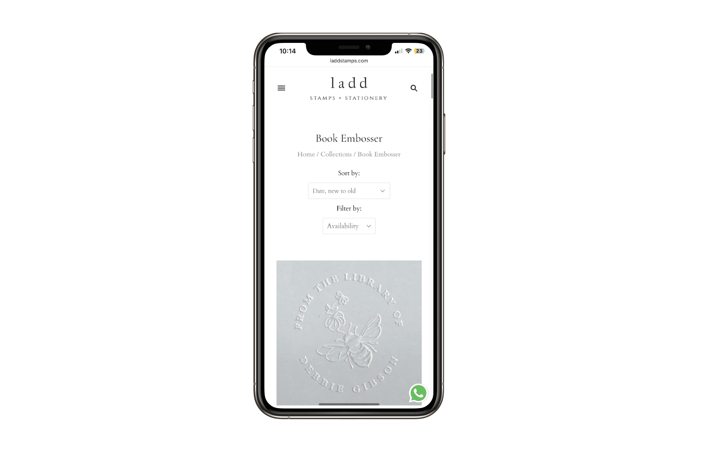
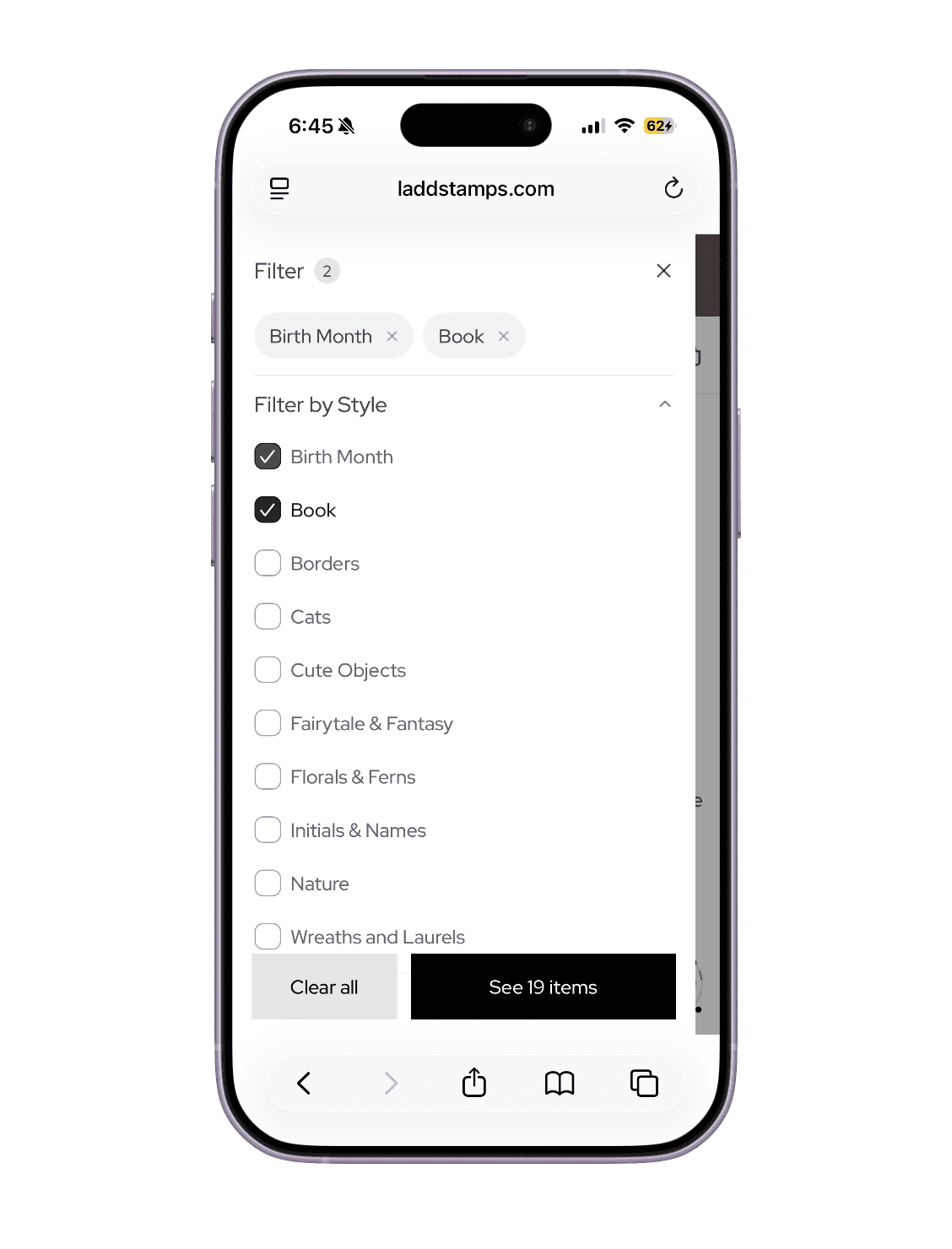
To improve mobile usability, a two-column product grid was introduced to reduce scrolling and increase product visibility. Quick-view with image swiping was added so users could preview multiple design variations without entering the product page, supporting faster comparison for design-driven products. Filters were implemented to help users navigate a large catalog of customizable options more efficiently.


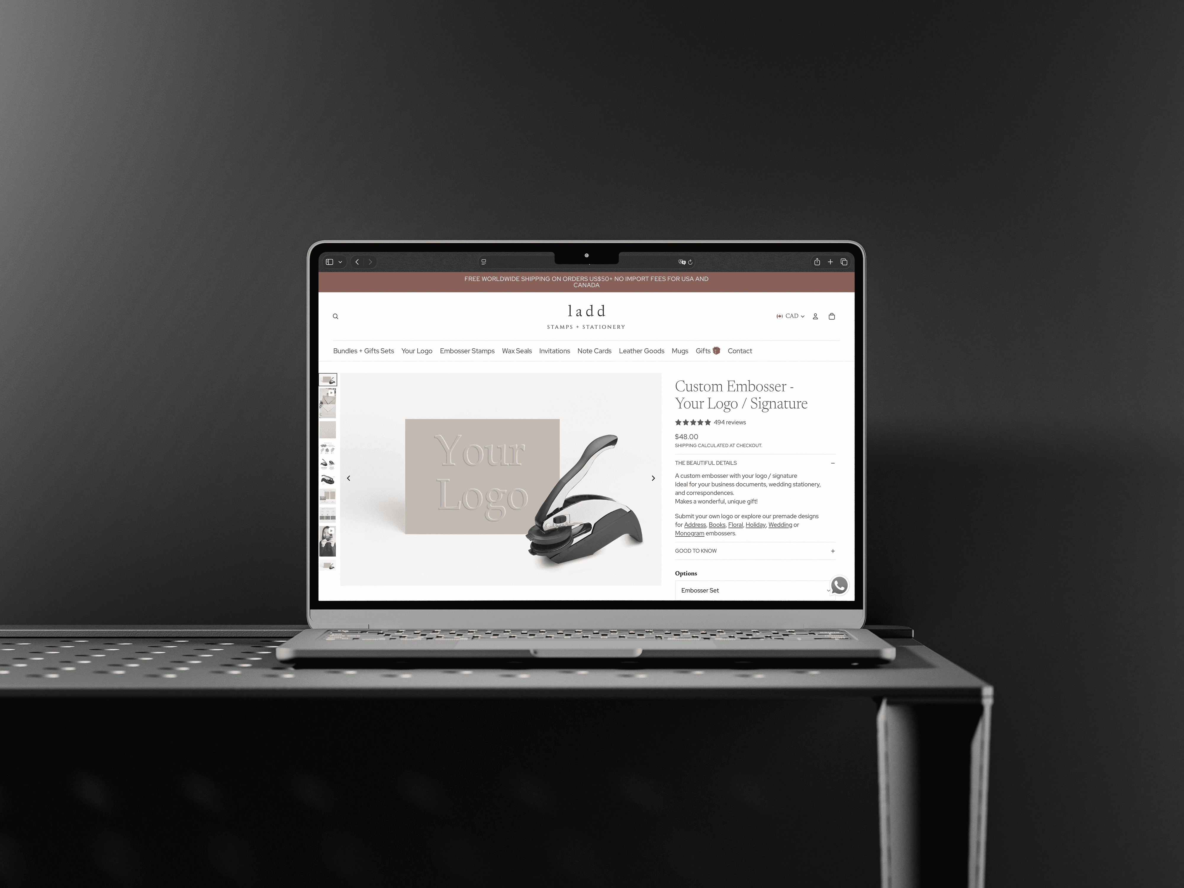
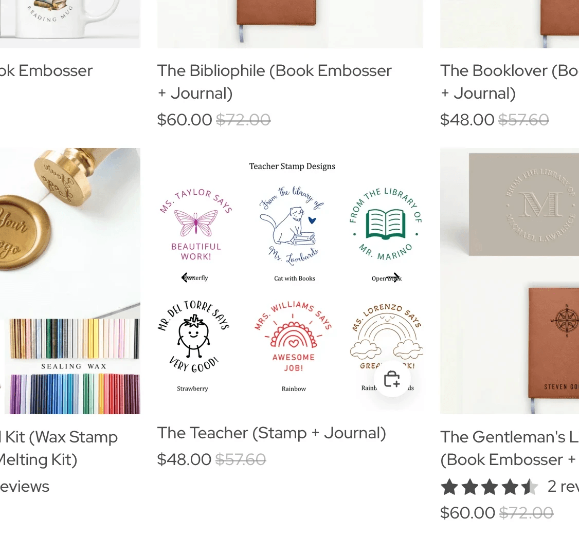
In addition, customization options were redesigned to be more prominent and mandatory, ensuring users provided all required information and understood differences between selections before checkout. Gift bundles and add-ons were introduced to increase average order value and encourage repeat purchasing.


Lastly, product and social media videos were added to improve product understanding and support marketing content across platforms.

project-image
project-image

Final Outcomes

Challenges

Challenges

A key challenge was navigating platform constraints within Shopify. While we initially aimed to introduce add-on options directly during checkout, Shopify’s checkout limitations restricted this functionality. To work around this, we introduced add-ons earlier in the product and cart flow, ensuring users were still exposed to complementary items.

Results & Metrics

Results & Metrics

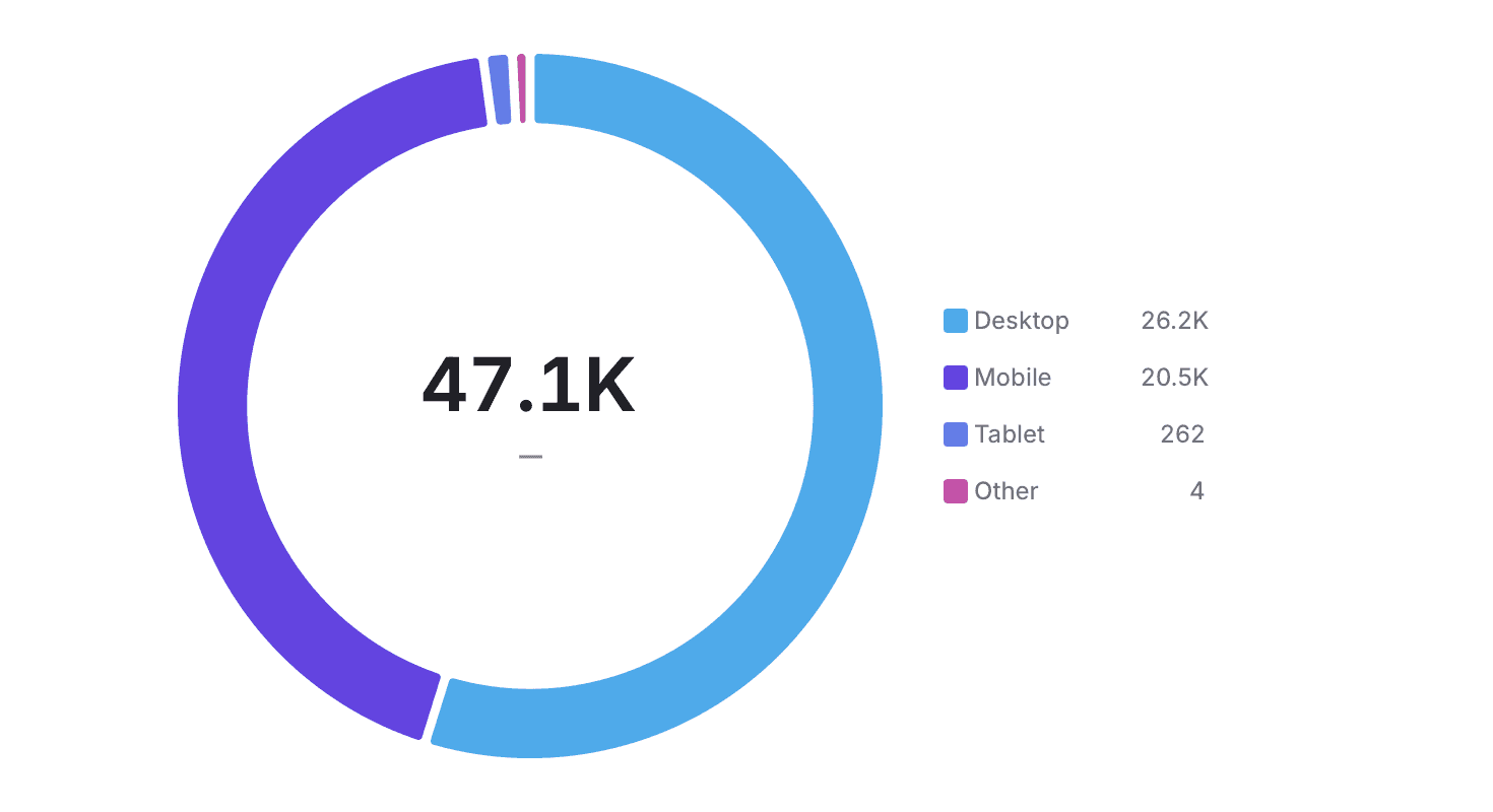
Following the website improvements, total sales increased by 41% compared to the previous quarter, with 0 customer emails reporting confusion during the purchasing process, indicating improved usability and clearer customization across the site.

project-image
project-image

More Projects

More Projects

project-image
project-image
project-image
Brand Logo